02/22/2011 - 02:53 AM
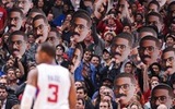
David asked me to update the new CTB banner to compliment the new changes here on CTB.
The Banners are the same but they do have subtle differences:
1.

2.

3.

4.

David asked me to update the new CTB banner to compliment the new changes here on CTB.
The Banners are the same but they do have subtle differences:
1.
2.
3.
4.
They look awesome- great job Joe!
I like 3 and probably 2 a lot if the jersey's were colored in as well
#3. Looks sharp
lookin good
#3 for me
I like the subtleties of just having the Jumbotron only in color myself. Not sure if any of you guys watched the HBO series The Pacific (Tom Hanks' 2nd installment- of Band of Brothers was his first). The sepia colored players reminds me of the opening credits.
I like #2 because it doesn't take the focus away from the "CTB" letters... anyhow, Nice work!
#2...is clean. #3 is a bit messy and the CTB gets lost.
#3 looks the best
4 is by far the best GFX wise but 1 is the best banner IMO. good work joe!
One thing I forgot to mention is that any banner can easily be changed. All I have to do is reduce the opacity or put a semi-transparent layer on top of the background to make the title pop.
Thanks Dunc!
Is there a version without a shadow behind the text and no italics? It might look a little more clean.
^^ That's the official font from the Clippers. Those are the official colors of the Clippers. I was given a spreadsheet from Clippers.com with all the logo and color information. Changing it would make it look more like a signature than a website banner. IMO
By the way, the shadow was used ONLY used to make the text stand out. I don't like using shadows on text ( Hate it) but I was limited with the actual size. The new banner will be 50% smaller. We have to keep that in mind.
can you change bledsoe with gallinari? 
they all look good, joe.
im gonna vote #2 since the colors of the forum's interface are pretty subdued as it is. vibrant color on a banner might mess with that feel. either way, though - they're all fantastic.
4 nice job
I say 2 is the best. It gives off a legendary sense everytime i look at it
number 3 looks the cleanest,, nice job!
#3 for me. All of us have different monitors and that can affect how these look and it might be why we all have a different opinion.
3s looking good
i'd have to go with 2
What happens when Blake gets traded to the Lakers this summer? The Banner will look dumb 
oh and Number 2 or 3. Nice work!
Great job, CJ!
I'll go with 2.
4 fo sho.
oh and Number 2 or 3. Nice work!
LOL.
No, David and I have the work file to make easy changes to it. We agreed that I would update the banner whenever he wants.
#2 is perfect.
It says i like attention but i rather you check out the rest of my features and not focus on me to long.
If that made any sense
#3 is the best
You nailed it. That was the look and feel I was going for. I wanted to give it a semi-tattered, worn feel to it. Kinda like an old painting/drawing on rice paper.
Kinda helps that I majored in commercial art for 2 years. 
I'm liking 3.
I like 4 personally as it's a bit larger and would fill in the top of this web page a bit better. I also have big favoritism for #2 as well. I like the shading and the little use of color.
HOWEVER, I wouldn't put a new banner up until after the trade deadline. Baron and/or Kaman could be traded. And I'd also get a new banner in place after the summer is ended because either one of those guys I named, could be gone and we could get a nice draft pick.
Great work overall, I'm loving it.
You nailed it. That was the look and feel I was going for. I wanted to give it a semi-tattered, worn feel to it. Kinda like an old painting/drawing on rice paper.
Kinda helps that I majored in commercial art for 2 years.
Hahaha. now if only there was this type of poster i could buy somewhere. I'd frame it and place it over my bed!...anyways, great job with it
It should be #2, but the size of #4
Trust me
#2 for sure
Maybe desaturate the players on #3 a bit...
#2 looks awesome.... I like how the red stands out just enough.
#3. Very nice job by the way
Personally, #2 is the best. The sepia tone effect makes it look mythical. Very well done Joe. Uhmm,, could you do me favor? Would you make a windshield LA Clippers decal for my car? hehe..
I like the 2nd one, and would like the 3rd one the best if Eric Gordon had that effect on him that all the other players had...
great job
great job
yeah, you're right. EJ's pic had better resolution than the rest. Just have to apply a bit more exposure and grunge it up a bit more. The final banner will be revised.
3 gets my vote... Better hope all those pieces stay for the next few days
# 2 or # 3 will be fine with me.
3.
Okay guys it looks like 2 and 3 are neck and neck- I'll cast the deciding vote once I try out both and see which one seems to look the best for the site. Joe when you get the chance go ahead and send me 2 and 3- thanks buddy.
please dont replace baron with mo williams. that's all i ask.
haha Ekker, i was just looking for this thread to say something about that.
Maybe now we can have CTB Vote on who the new Clipper Head should be! Yay!
oh and Number 2 or 3. Nice work!
and like that you jinxed it! haha good job kid. but yea, lets just go ahead and put dwill's head on there to show him how much we want him.. whats the worst that happens, he acts like everyother FA and doesnt come here?
Should Gomes or Foye or Aminu go up there instead? I'm not so sure. As much as I am iffy on the trade, Mo Williams is going to an important piece so definitely he needs to be in it to replace Baron.
Should Gomes or Foye or Aminu go up there instead? I'm not so sure. As much as I am iffy on the trade, Mo Williams is going to an important piece so definitely he needs to be in it to replace Baron.
lets put donald sterling's head up there.
or VDN.